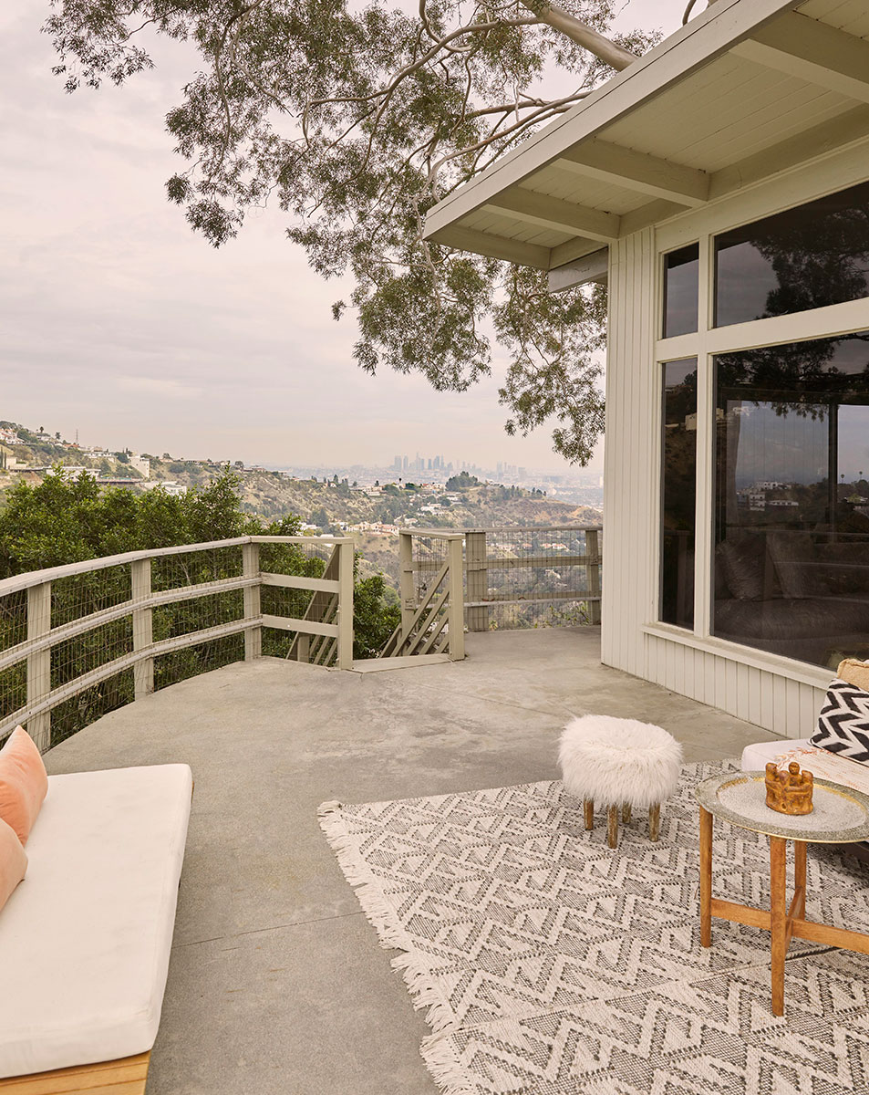

Perhaps because Laurel Canyon has a rich history through the 60s and 70s as the home of many rock musicians such as Frank Zappa, Jim Morrison, Neil Young, etc. I immediately loved the energy surrounding the area.
Although not very pretty from the outside (totally unmodernised since its build) the 360° view of the canyon (and Mulhollhand Drive) was ultimately what sealed the deal. The 1500 sq ft house, looked more like a modern tree house than the mid-century modern bungalow I was looking for. But the simple structure was the perfect size and canvas to create the Los Angeles pied-a-terre I was after.
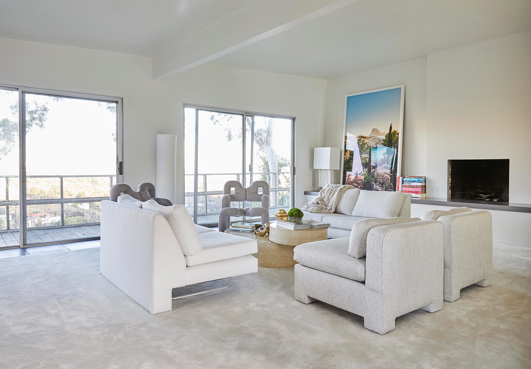
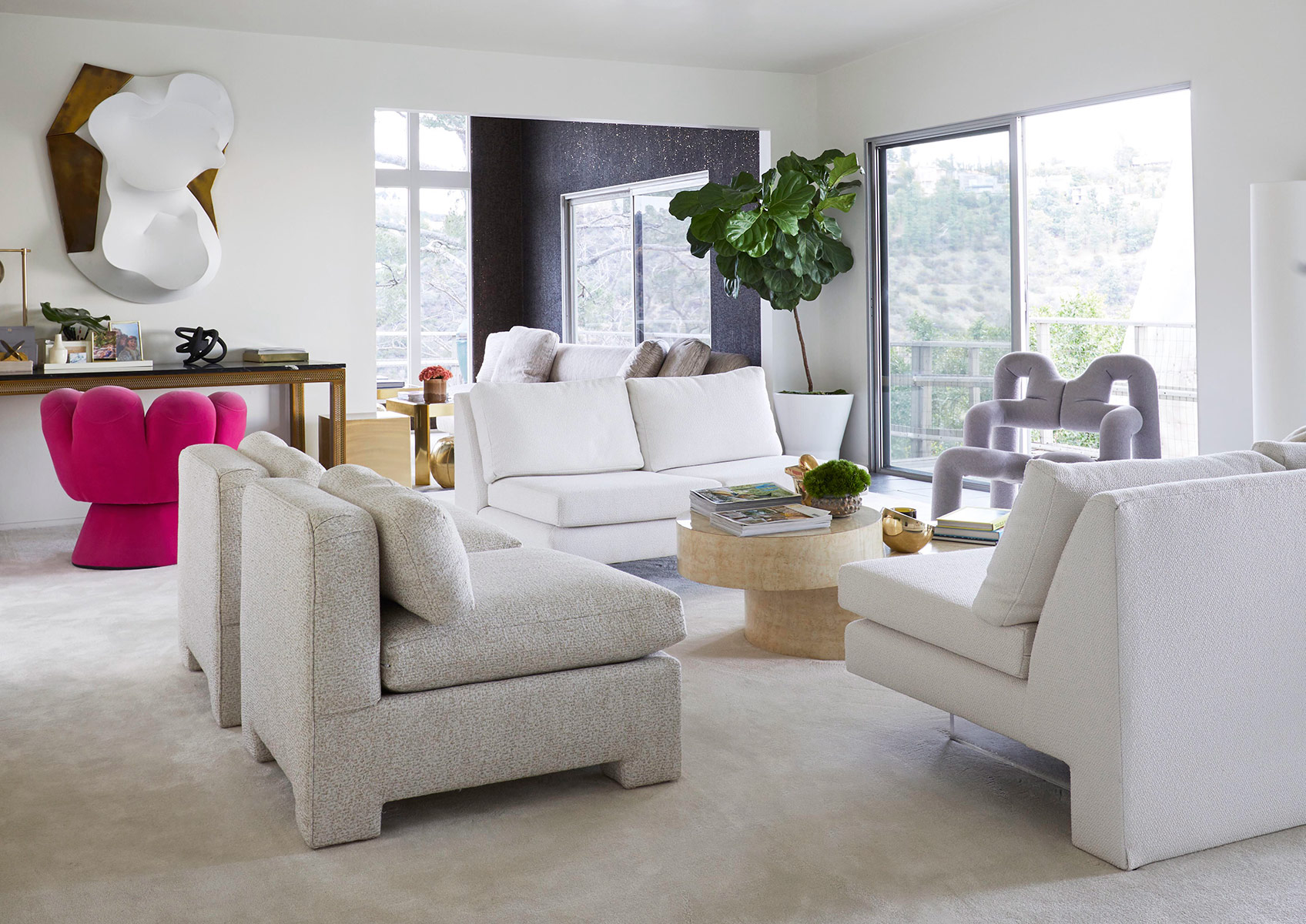
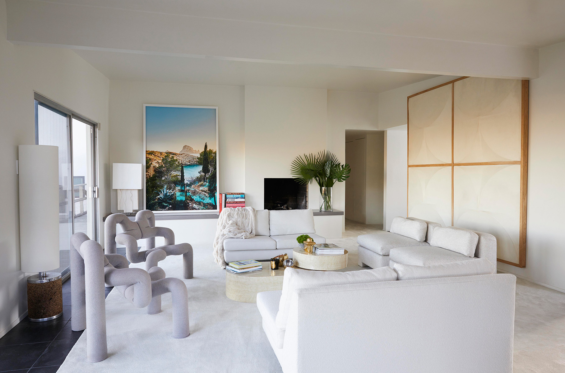
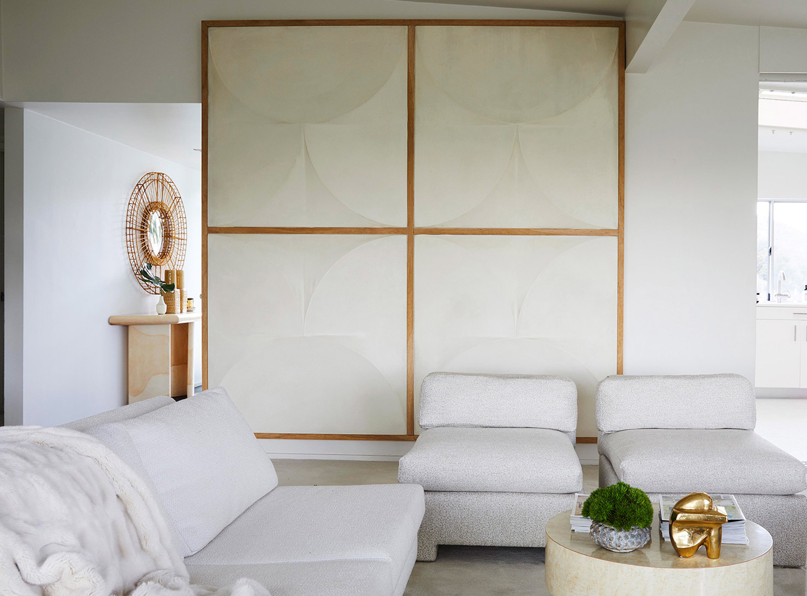
My first step was to change the industrial grey carpet for something neutral which would go with any colour scheme. I settled on a Coconut milk Stark Carpet which was unusual but worked with the original grey slate and 70s tiling of the bathrooms. I kept the coconut milk colour tone for the sofas and slipper chairs in the living room. A tone I had not used before but which I loved to work with.
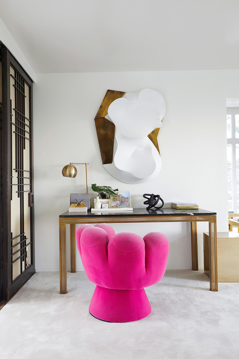
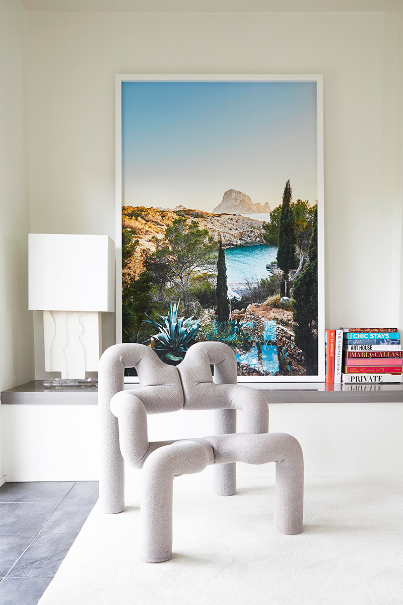
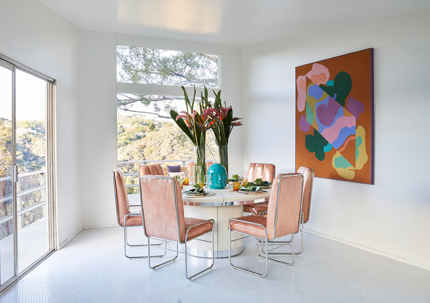
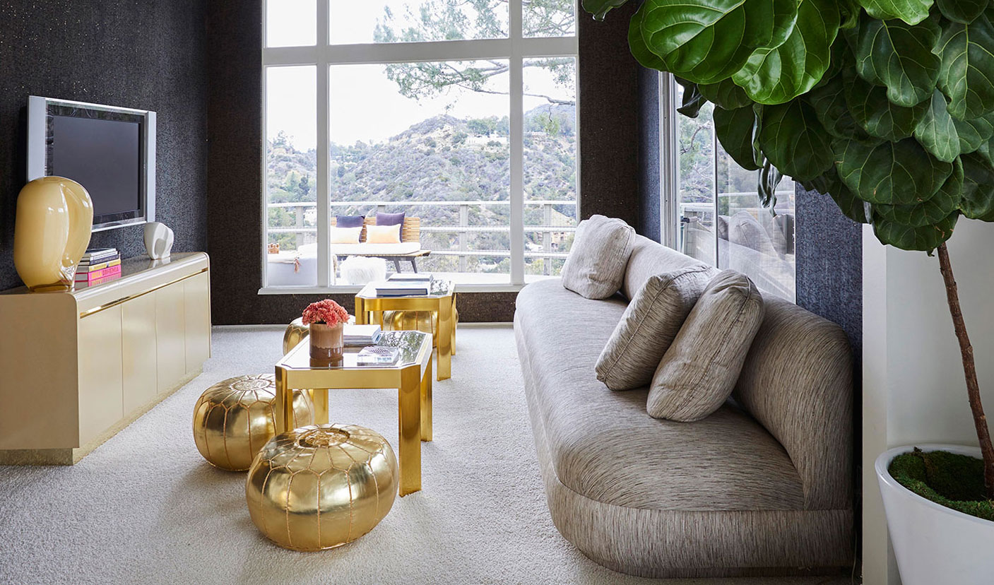
I decided to turn the TV room into a very decadent Hollywood glamour area. The Steve Chase sofa – 4.5 m long and with an illuminated base – was my first find and I knew it would make the room!I didn't want too much furniture in the house but equally wanted it to be comfortable and a reflection of my own style and that of the Hollywood hills. Again I chose a cream carpet from Stark Carpet for that area, always a winner, and with a contrast of dark chocolate cork walls (from my favourite Philipp Jeffries), the combination is striking. The gold and bronze glass top coffee tables were another Miami vintage find. Easy, chic, functional and perfect for the room.
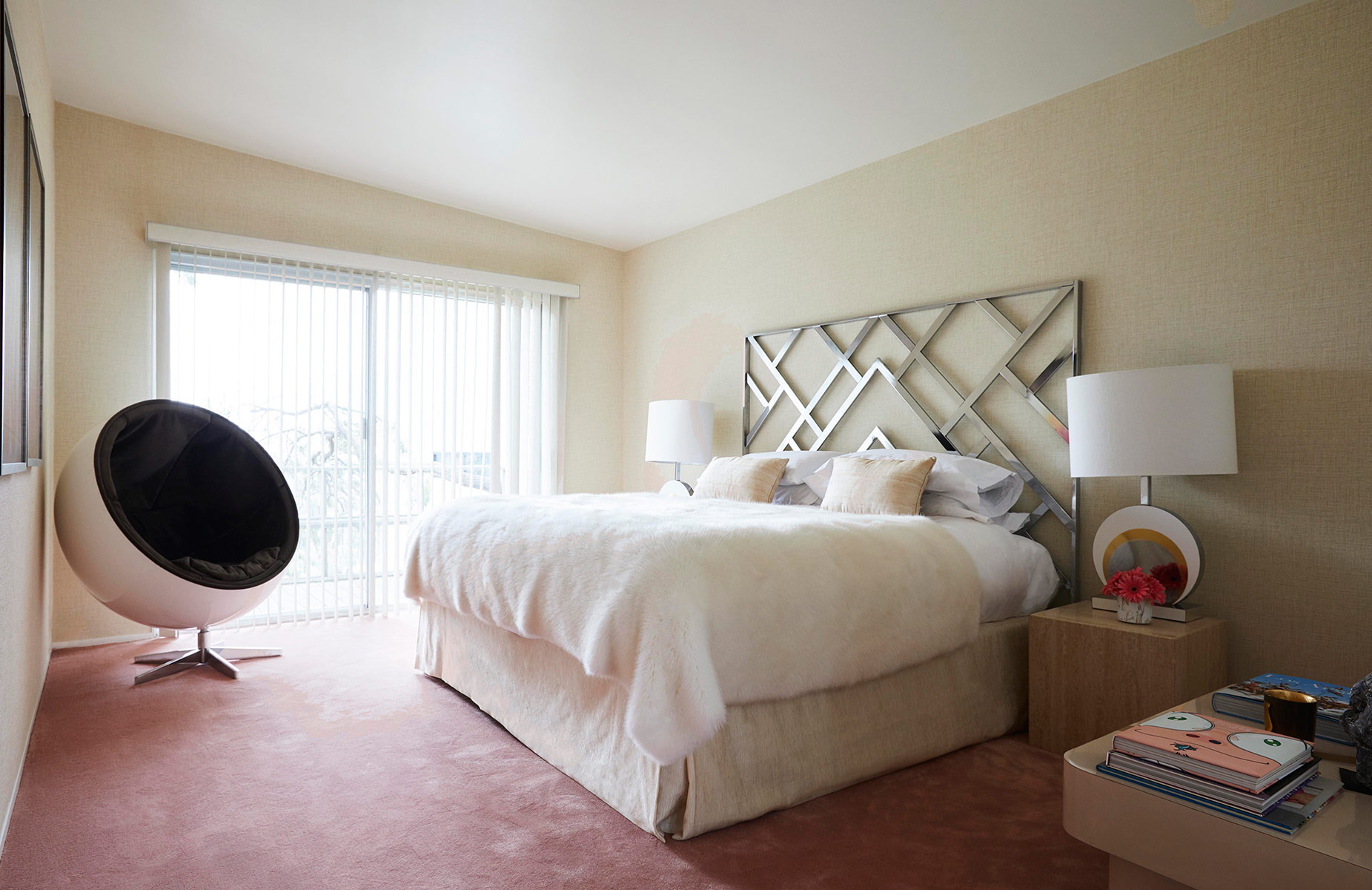
This being LA I wanted a bedroom which was a bit fun and 'California dreaming'. I don't use pink much in my designs but here decided to put a coral pink carpet. And cream walls. It's a fun happy bedroom which I accessorised with art pieces like the Murakami limited edition pillow framed in a Perspex box. Minimal art and furniture kept the room clean, fun, fresh and Californian. I like to challenge myself (and clients) and don't like to always work with the same colours or textures but think about the environment.
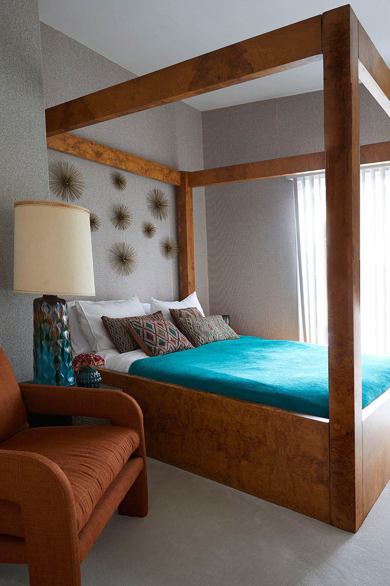

LA has a lot of great vintage stores and it was easy to pick pieces here and there to complete the design of the house.
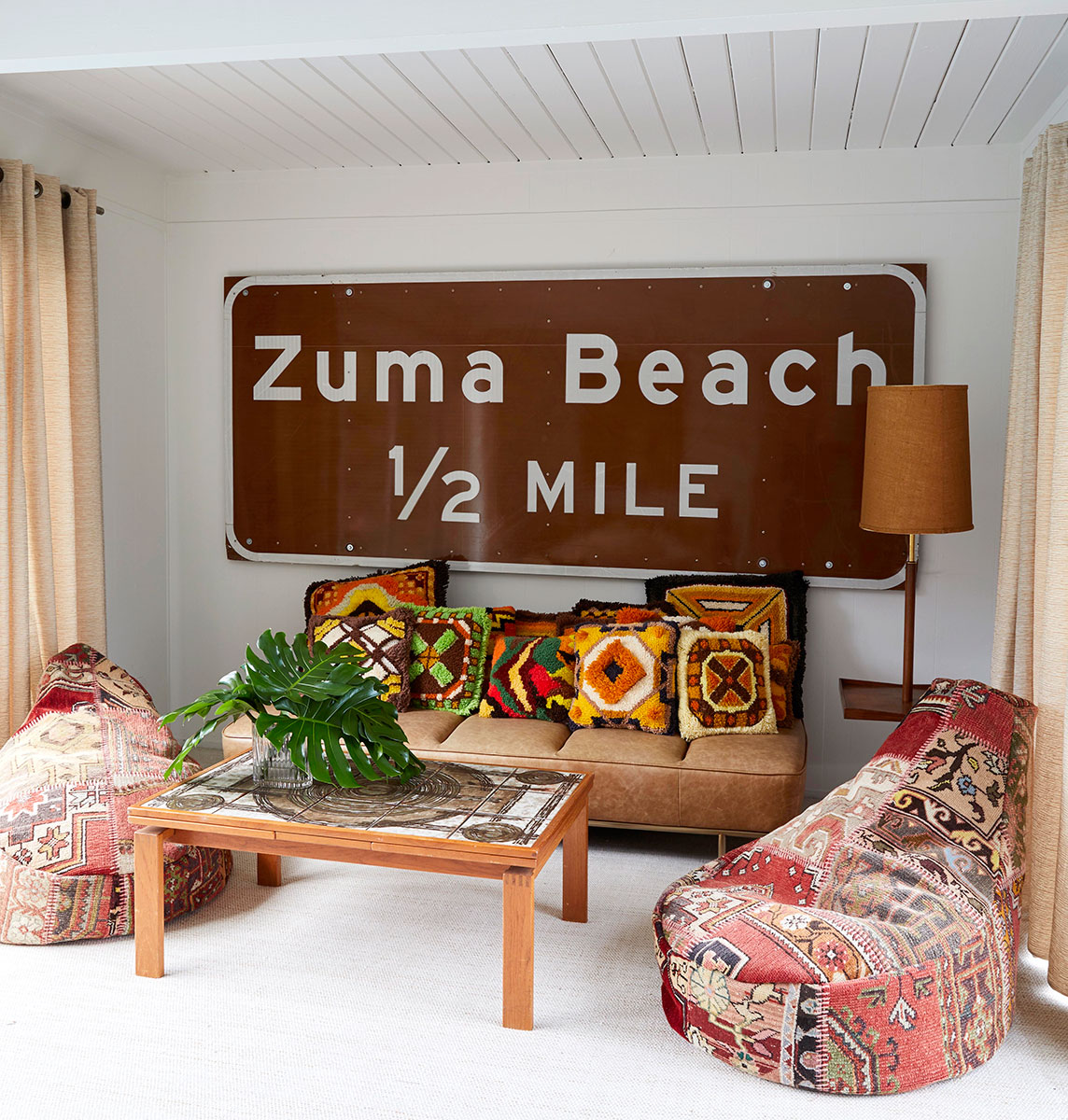
My favourite piece for the first room I designed – the Pool Guest house – is the Zuma Beach sign, a unique 70s sign found at my favourite vintage surf store, Surfing Cowboys. A total 'love at first sight' purchase. The room has that real 70s vintage feel and suits the simple wooden Guest house, which again is a mini tree house overlooking the Canyon.
I designed and completed this house in less than a month. Understanding the essence of a place is extremely important but working with great stores, suppliers and workers made this happen. I love this house and am proud of what I have achieved because it is simple, sophisticated, cosy and functional but also suits the simplicity of its build and the views it goes with.
