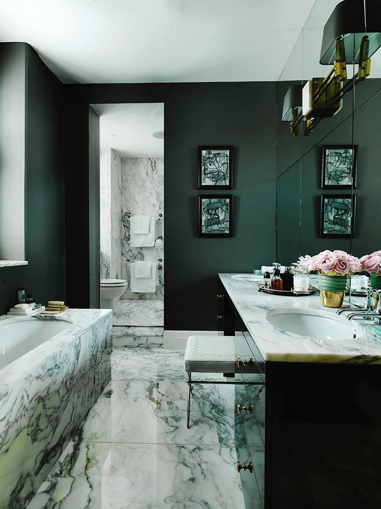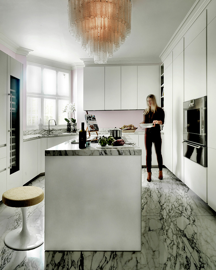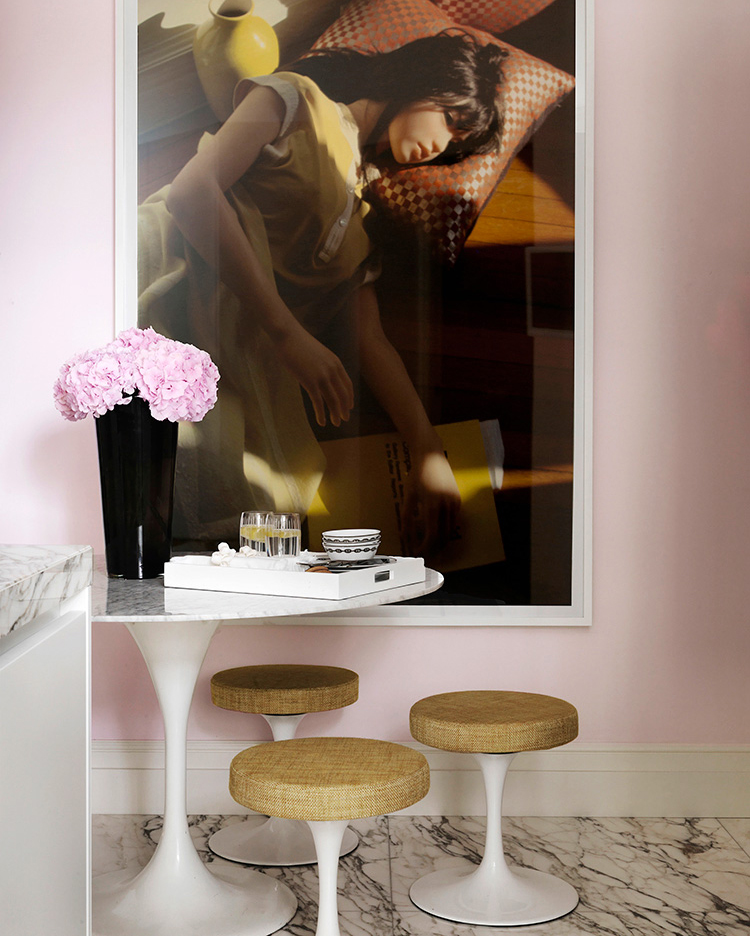

The new design and color scheme is an evolution of my personal tastes and of my work over the past few years. Working with various clients in different cities in the world inspired me - as always - but I felt the need to clear the spaces and brighten up some rooms.
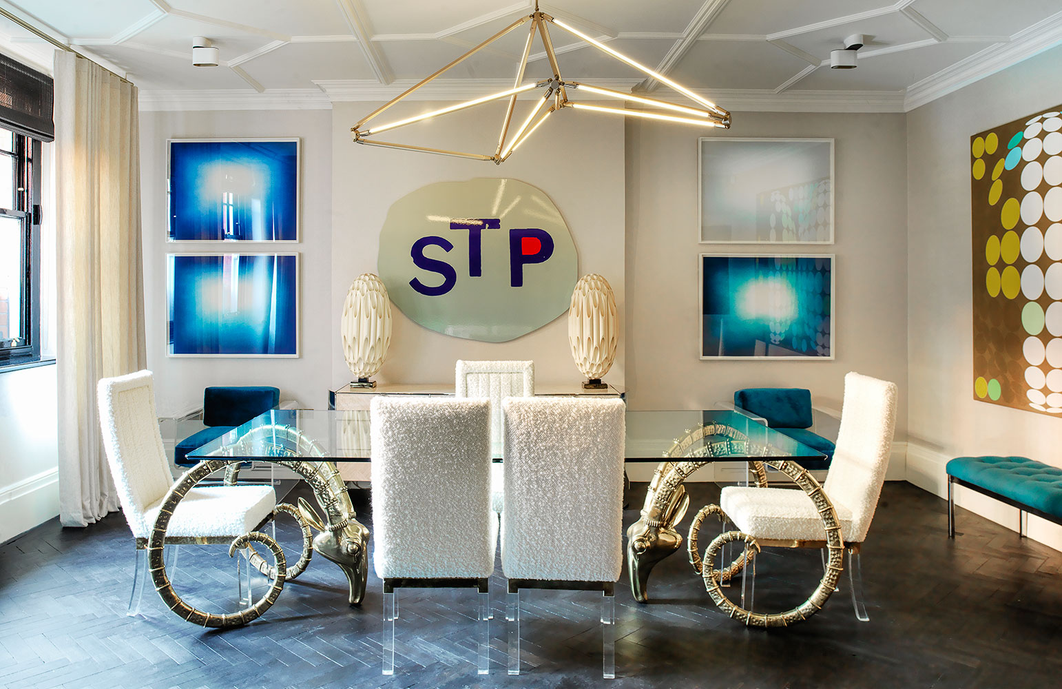
My art collection constantly growing, it was the purchase of the appropriately titled Sylvie Fleury canvas Past, present and future which was the catalyst for the overhaul of the appartment. Art always seems to dictate a certain creative direction for me. Sylvie Fleury's gold and bright colors could only be matched by those of Anish Kapoor's Blue Shadow prints which were previously in a different part of the house. Lucien Smith's STP was inevitably the next one to move into the dining room. The walls needed a pale cream to allow those vibrant hues to shine.

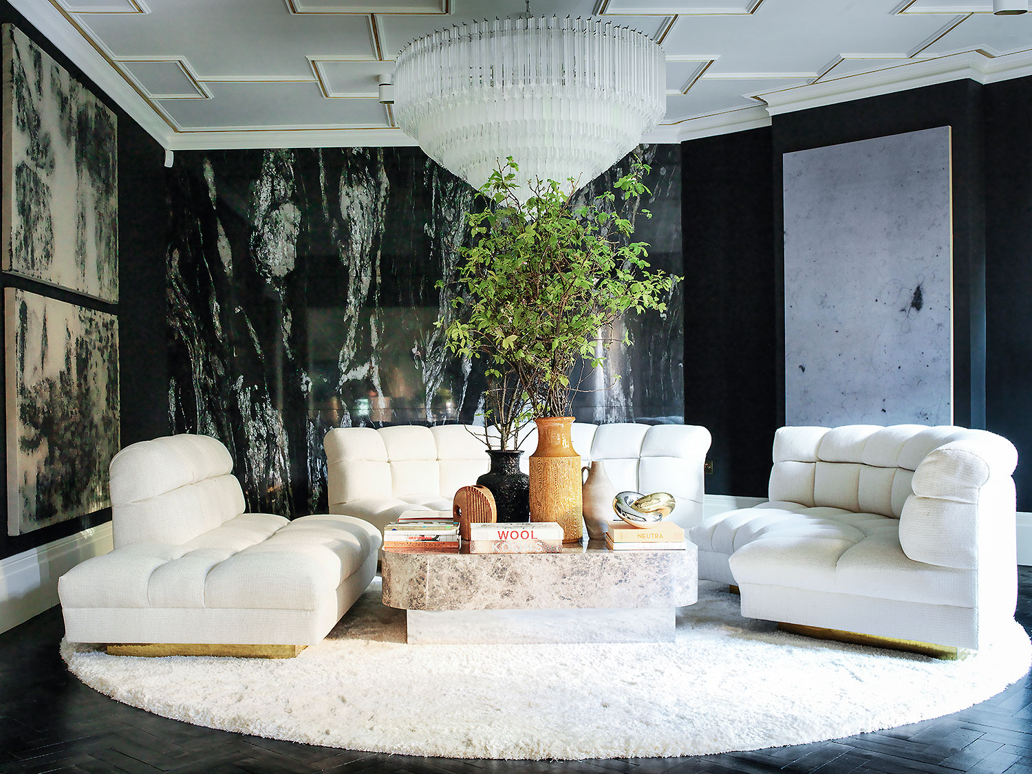
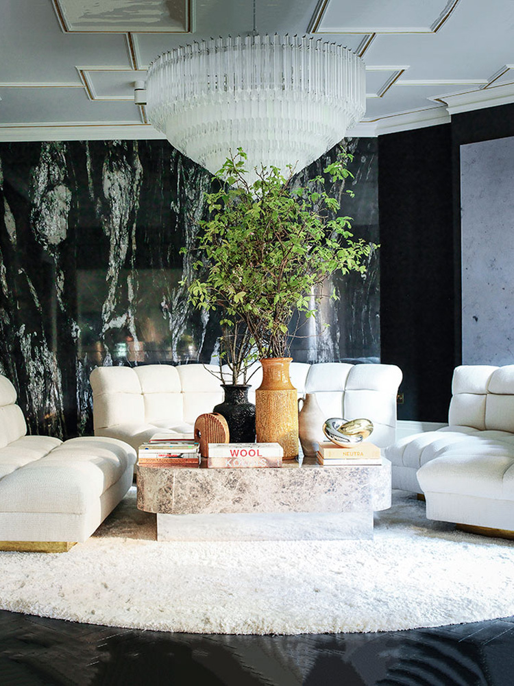
I felt that the sitting room still needed to keep its dark moody walls and I gave it a black coat over the previous chocolate paint. Again, the art pieces in that room were instrumental to tying the new color palette together. Adding some gold gild in between the lattice ceiling was a "lets see if this works" last minute job. And work it did. The existing sofa was reupholstered in a new Robert Allen travertine fabric and taken apart to give it a new life, so to speak. Having seen many Pierre Paulin retrospectives recently, this had a major influence in designing this stunning round bespoke Stark shaggy rug. The result is fresh, clean, elegant, chic and uber cool.
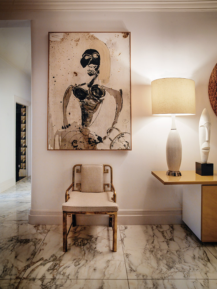
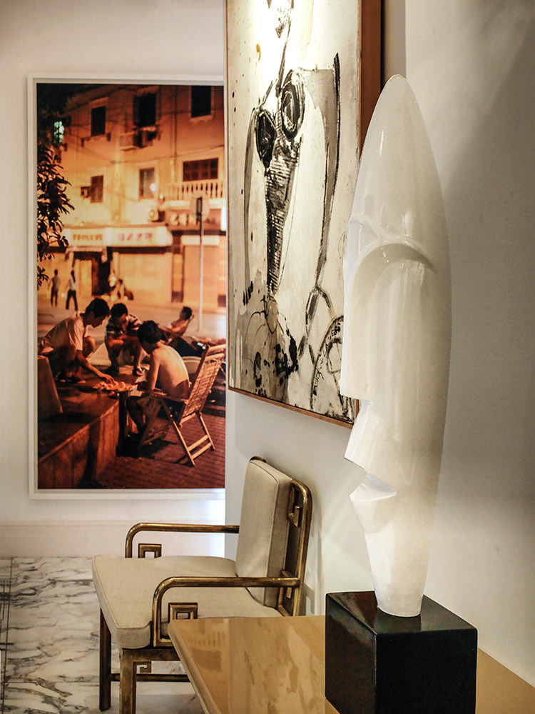
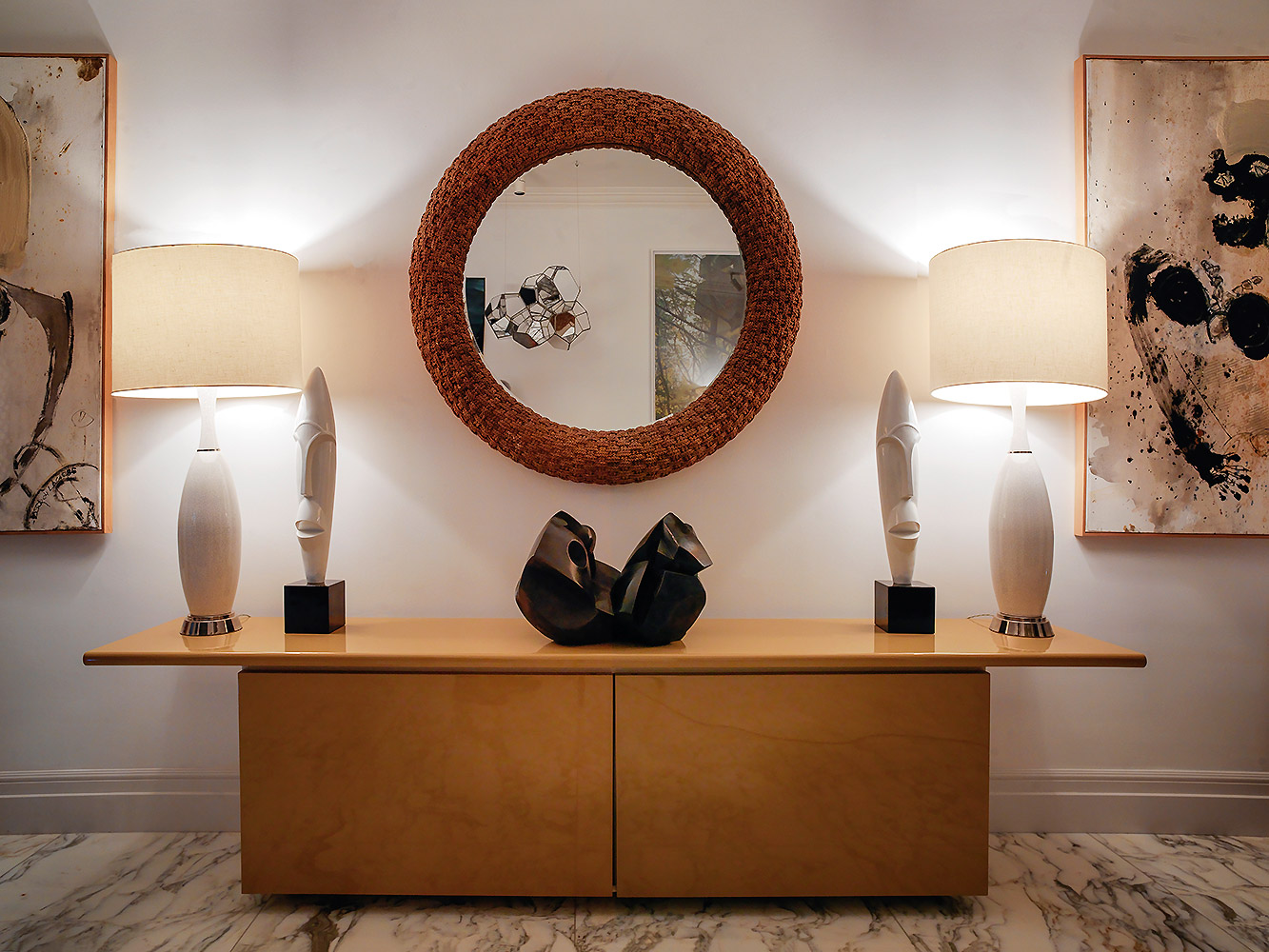
The hallway was repainted white and except for a few large art pieces which had to be showcased in this large and inviting hallway, most of the art was moved into new rooms. Visitors always asked me whether this or this piece is new when in fact it was in another room which they had previously not paid attention to. A new Jerome Robbe piece (varnish on a mirrored perspex) now proudly resides next to the Tomas Saraceno Galactic Cumulus installation.
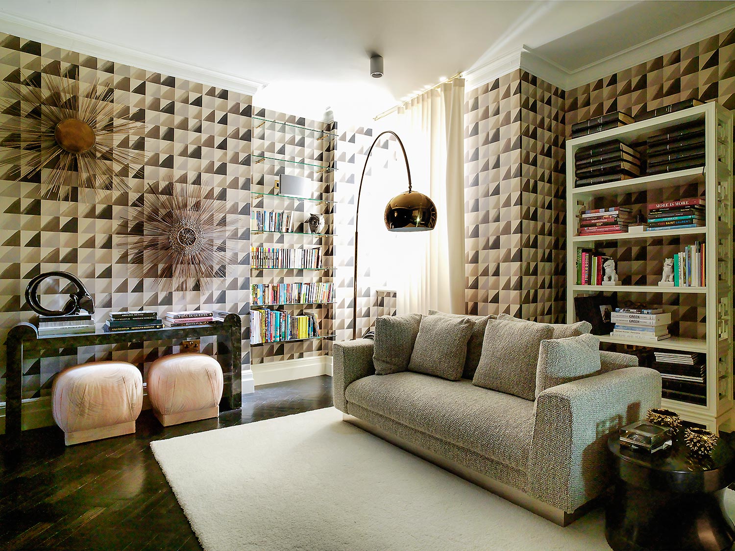
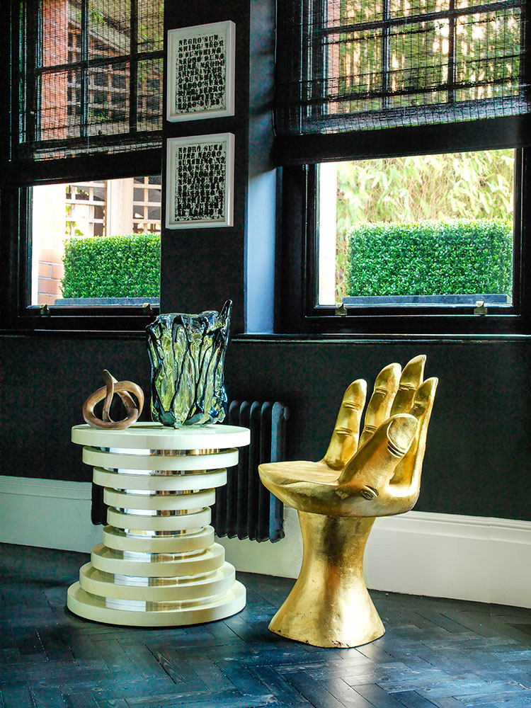
The family room went from dark wood panels and deep blue velvet and cream accents to a variation of grey, cream, black and dusty pink. The pair of marshmallow paint splattered stools purchased in Miami were the starting point for the restyling of this room. The vintage gold Arco Flos lamp was the last piece to find its way into the room, having been found in Miami as well and meant to go to a client's house. Again, an off-white Stark rug ties it all in.
The office remained unchanged except for adding a few extra oil pieces from Glen Rubsamen.
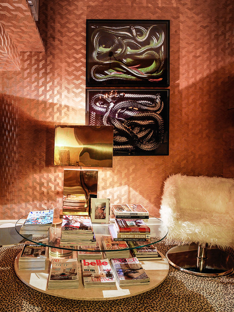
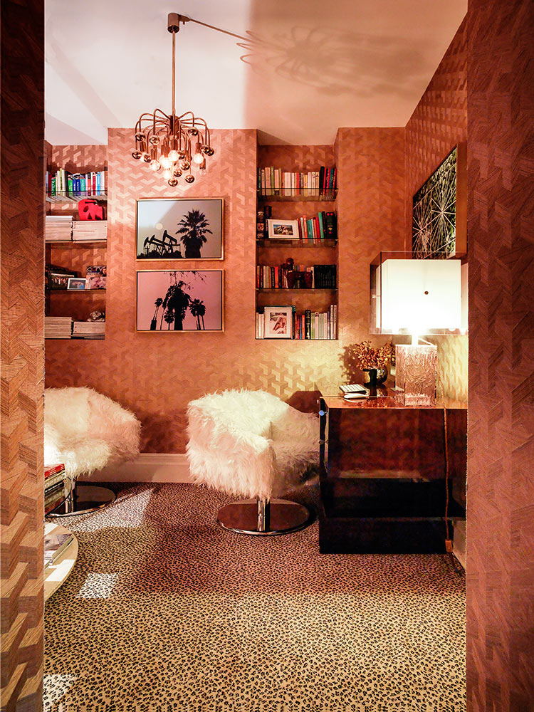
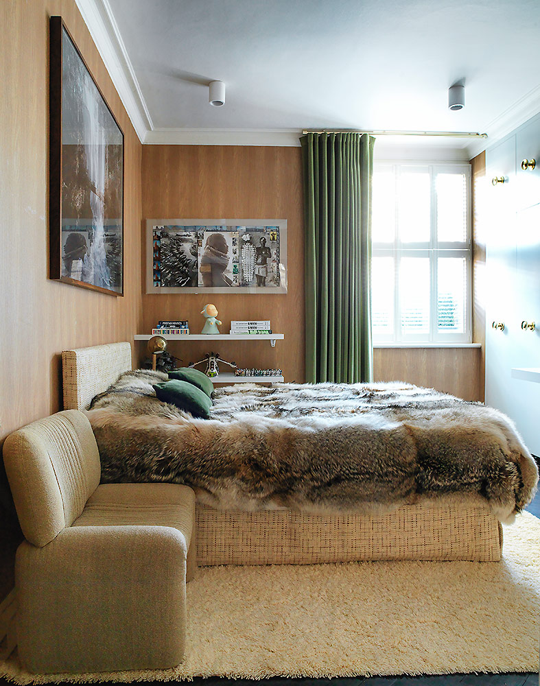
The teenager's bedroom was dramatically changed. From a Philipp Jeffries green seagrass to a fake natural oakwood wallpaper reminiscent, as my amazing wallpaper expert casually mentioned, of that of a 70s camper van. Exactly the vibe we wanted to create. Again the shaggy rug idea in a creamy hue was a winner.
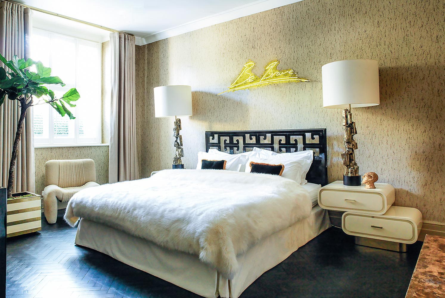
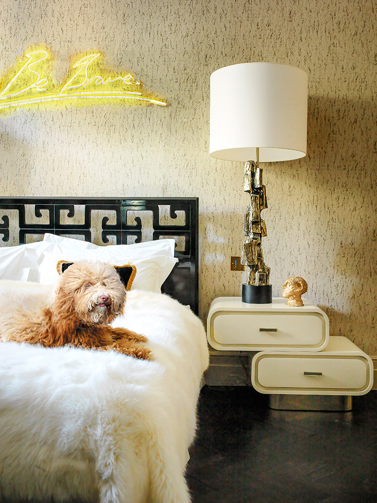
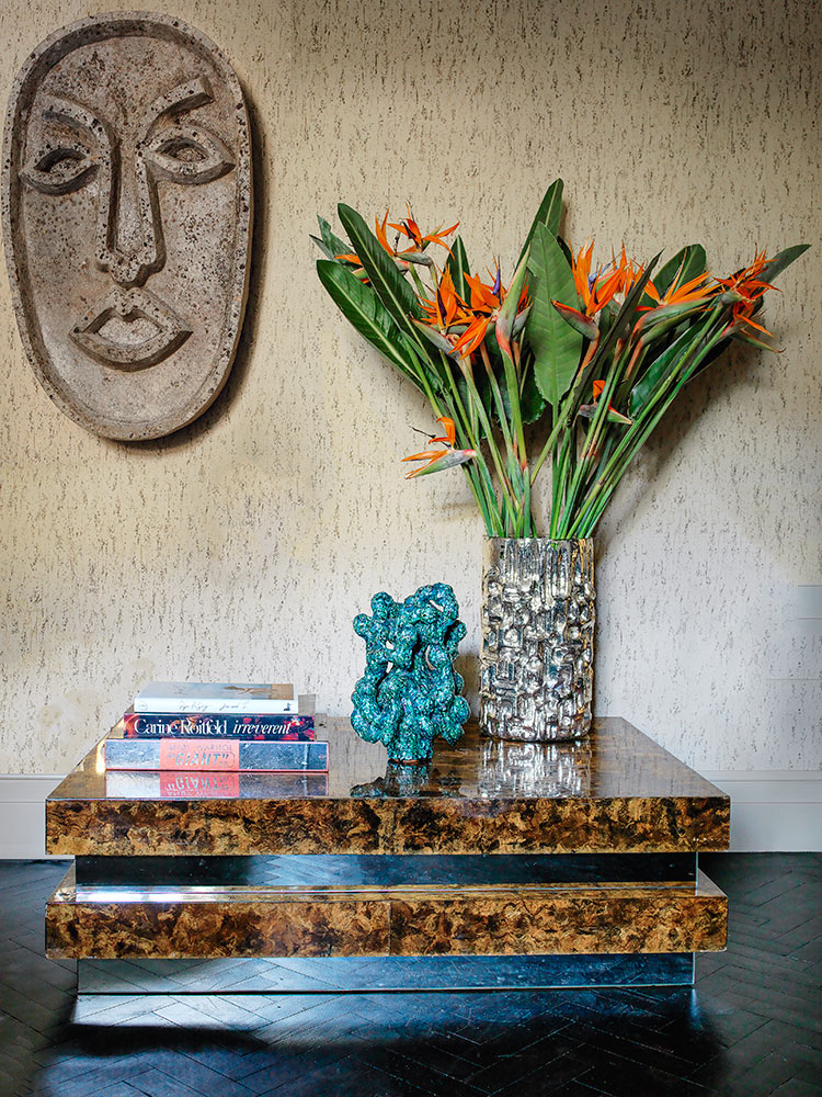
The master bedroom was created around the pair of stunning 'cloud' bedside tables, sourced again in Miami. One of my favorite stones is travertine and when I found Cole & Son's wallpaper, I went for the all travertine look which I had been dreaming about. A 70s chair in its original and impeccable fabric could not have matched the new colors of this room more perfectly. Removing the rug and the sofa in that room made a lot more space but kept its practicality.
This remix shows how you can dramatically change the look of a house while re-using most items, moving things around and injecting new blood by adding new pieces and color schemes.
